Flame Graphs: Making the Opaque Obvious (2017)
Flame graphs visually represent process execution to identify performance bottlenecks. They display runtime percentage and stack depth, aiding developers in optimizing code efficiently by focusing on critical functions.
Read original article

Flame graphs are a powerful tool for identifying performance bottlenecks in applications. By visually representing the execution of a process based on sampled data, flame graphs display the percentage of overall runtime on the X-axis and the execution stack depth on the Y-axis. Wider sections of the graph indicate functions consuming a larger share of runtime, highlighting areas for optimization. This visualization method can quickly pinpoint where a program spends its time, revealing inefficiencies in code paths. By analyzing flame graphs, developers can optimize performance by focusing on functions with wider stacks. A real-world example demonstrates how flame graphs helped identify and resolve a performance issue in a C++ application, resulting in a significant speedup. Generating flame graphs on Linux using tools like GCC and scripts allows developers to visualize and analyze program execution, facilitating performance improvements. Overall, flame graphs offer a clear and efficient way to optimize application performance by identifying hotspots and guiding code optimization efforts.
Related
Eight million pixels and counting: improving texture atlas allocation in Firefox (2021)
Improving texture atlas allocation in WebRender with the guillotiere crate reduces texture memory usage. The guillotine algorithm was replaced due to fragmentation issues, leading to a more efficient allocator. Visualizing the atlas in SVG aids debugging. Rust's simplicity and Cargo fuzz testing are praised for code development and robustness. Enhancements in draw call batching and texture upload aim to boost performance on low-end Intel GPUs by optimizing texture atlases.
Fuzz Map
Fuzz Map automates GUI fuzzing to uncover unexpected states and crashes by creating visual maps through code coverage. It simplifies complex program behavior, enhancing developers' ability to verify code changes.
Flambda2 Ep. 2: Loopifying Tail-Recursive Functions
Flambda2's Episode 2 explores Loopify, an optimization algorithm for tail-recursive functions in OCaml. It transforms recursion into loops, enhancing memory efficiency without compromising functional programming principles.
Understanding React Compiler
React's core architecture simplifies app development but can lead to performance issues. The React team introduced React Compiler to automate performance tuning by rewriting code using AST, memoization, and hook storage for optimization.
Bpftop: Dynamic real-time view of running eBPF programs
The GitHub repository for `bpftop` by Netflix provides real-time monitoring of eBPF programs with statistics like average runtime, events per second, and CPU usage. Visit https://github.com/Netflix/bpftop for more details.
 6 comments
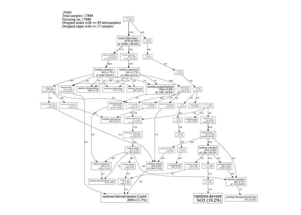
pprof from https://github.com/google/pprof can produce a DAG view of a profile where nodes are sized proportional to their cumulative time, e.g., https://slcjordan.github.io/images/pprof/graphviz.png and such a view would seem to cover the case above and subsume the usual use cases for a flame graph, would it not?
Although I guess a flat text profile of functions sorted by time would also highlight these kinds of hot spots. Still, if we want a single graphical view as a go-to, it's not clear that flame graphs are all that much better than pprof DAGs.
I tried to follow along with things that are relevant to my job, like https://randomascii.wordpress.com/2016/09/05/etw-flame-graph... ...And totally failed? I look at the reddest part of the chart, I look at the peaks, and none of that matches the conclusion reached in the blog post?
And then I tried to grok all the knowledge conveyed in https://www.brendangregg.com/flamegraphs.html and... came away similarly confused? Sure, I see patterns, but when asked to identify which of those patterns indicate problems, I would still score <50%?
And, I mean, I do memory/CPU traces like all day every day, and I fix code all the time based on that, but that's all just based on hierarchical bar charts, which are NOT the same as inverted flame graphs, as far as I can tell?
Anyway, thanks for coming to my therapy session, and feel free to leave your helpful-comment-that-will-finally-enlighten-me and/or downvote at the door.
My tool could handle one snapshot or hundreds of thousands of them and it was more useful to aggregate many snapshots I used on Brandan Gregg perl script implementation as reference but wrote all the code myself from scratch to produce just what I wanted. One of the more key things I felt was different was was adding color coding of the TYPE of the call frame based off the code namespace - like green for Oracle jdbc driver or blue for websphere entry or light azure for the clr internals. With multiple contrasting colors one could see the important transitions from own code to library code and back to own code.
It was one of the most fun coding challenges I've ever done. Pretty much the only time I had to refactor recursion into stack because some of the call graphs (looking at you java) were so ridiculously deep
https://github.com/Appdynamics/AppDynamics.DEXTER/wiki/Flame...
Related
Eight million pixels and counting: improving texture atlas allocation in Firefox (2021)
Improving texture atlas allocation in WebRender with the guillotiere crate reduces texture memory usage. The guillotine algorithm was replaced due to fragmentation issues, leading to a more efficient allocator. Visualizing the atlas in SVG aids debugging. Rust's simplicity and Cargo fuzz testing are praised for code development and robustness. Enhancements in draw call batching and texture upload aim to boost performance on low-end Intel GPUs by optimizing texture atlases.
Fuzz Map
Fuzz Map automates GUI fuzzing to uncover unexpected states and crashes by creating visual maps through code coverage. It simplifies complex program behavior, enhancing developers' ability to verify code changes.
Flambda2 Ep. 2: Loopifying Tail-Recursive Functions
Flambda2's Episode 2 explores Loopify, an optimization algorithm for tail-recursive functions in OCaml. It transforms recursion into loops, enhancing memory efficiency without compromising functional programming principles.
Understanding React Compiler
React's core architecture simplifies app development but can lead to performance issues. The React team introduced React Compiler to automate performance tuning by rewriting code using AST, memoization, and hook storage for optimization.
Bpftop: Dynamic real-time view of running eBPF programs
The GitHub repository for `bpftop` by Netflix provides real-time monitoring of eBPF programs with statistics like average runtime, events per second, and CPU usage. Visit https://github.com/Netflix/bpftop for more details.